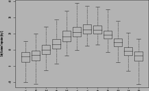
The boxplot is a useful way of plotting the 5 quantiles ![]() ,
,
![]() ,
, ![]() ,
, ![]() and
and ![]() of the data.
The ends of the whiskers show the position of the
minimum and maximum of the data whereas the edges
and line in centre of the box show the upper and lower
quartiles and the median.
Sometimes shorter whiskers that extend 1.5 IQR above and
below the median are drawn instead of ones that cover the
whole range (see the software help for details).
The whiskers show at a glance the behaviour of the extreme
outliers, whereas the box edges and mid-line summarize the
sample in a resistant manner. For symmetrically distributed
data the mid-line (median) is half way between the upper and
lower edges of the box (the upper and lower quartiles).
The Yule-Kendall skewness statistic in Eqn. (2.6) is a
standardised measure of how far the median is from the middle
of the box.
of the data.
The ends of the whiskers show the position of the
minimum and maximum of the data whereas the edges
and line in centre of the box show the upper and lower
quartiles and the median.
Sometimes shorter whiskers that extend 1.5 IQR above and
below the median are drawn instead of ones that cover the
whole range (see the software help for details).
The whiskers show at a glance the behaviour of the extreme
outliers, whereas the box edges and mid-line summarize the
sample in a resistant manner. For symmetrically distributed
data the mid-line (median) is half way between the upper and
lower edges of the box (the upper and lower quartiles).
The Yule-Kendall skewness statistic in Eqn. (2.6) is a
standardised measure of how far the median is from the middle
of the box.
Boxplots are particularly useful for comparing multiple samples of data from, say, different experiments. The boxplots for each sample can be stacked side-by-side to allow easy visual comparison of the between and within sample spreads of the different samples.
 |