


Next: Quantile-quantile plot
Up: Graphical representation
Previous: Boxplot (box-and-whiskers plot)
Contents
The range of values is divided up into a finite set of
class intervals (bins). The number of objects
in each bin is then counted and divided by the sample size
to obtain the frequency of occurrence and then these
are plotted as vertical bars of varying height.
It is also possible to divide the frequencies by the bin
width to obtain frequency densities that can then
be compared to probability densities from theoretical distributions.
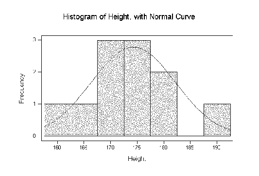
For example, a suitably scaled normal
probability density function has
been superimposed on the frequency histogram in Figure 2.3.
Figure:
Histogram of sample heights showing frequency
in each bin with suitably scaled normal density curve
superimposed.
 |
The histogram quickly reveals the location, spread, and
shape of the distribution. The shape of the distribution
can be unimodal (one hump), multimodal (many humps),
skewed (fatter tail to left or right), or more-peaked
and fatter tails (leptokurtic), or less-peaked and thinner
tails (platykurtic) than a normal (Gaussian) distribution.
David Stephenson
2005-09-30