An alternative way to compare the frequency distribution of a sample
to a theoretical distribution such as the normal distribution is by
plotting the order statistics ![]() , ...,
, ..., ![]() against the
corresponding
against the
corresponding ![]() , ...,
, ..., ![]() quantiles of the
theoretical distribution. If the sample follows the theoretical
distribution then the points will fall approximately along a straight
line. This plot is particularly good for revealing discrepancies in
the lower and upper tails of the distributions. It can also be used
to compare two samples by plotting the two sets of order statistics
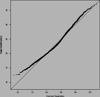
against one another. Figure 2.4 shows that the July daily maximum
temperatures at Uccle have shorter lower and upper tails than a normal
distribution.
quantiles of the
theoretical distribution. If the sample follows the theoretical
distribution then the points will fall approximately along a straight
line. This plot is particularly good for revealing discrepancies in
the lower and upper tails of the distributions. It can also be used
to compare two samples by plotting the two sets of order statistics
against one another. Figure 2.4 shows that the July daily maximum
temperatures at Uccle have shorter lower and upper tails than a normal
distribution.
 |
It can also be
useful to plot the empirical distribution function (e.d.f)
and the theoretically-derived cumulative distribution function
(c.d.f).
The e.d.f (or ogive) is a bar plot of the accumulated
frequencies in the histogram and the c.d.f is the integral
of the density function - e.g. the staircase and smooth curve
respectively shown in the lower panel of Fig. 2.1.
These cumulative distribution functions give directly
empirical probabilities ![]() as a function of
quantile value
as a function of
quantile value ![]() .
Mathematical definitions of these quantities will be given later
in Chapter 4.
.
Mathematical definitions of these quantities will be given later
in Chapter 4.